Epic Loops
Complex low-fidelity interface design exploration
School project focused on designing a system for a roller coaster theme park, addressing the needs of different stakeholders

Role
UX / UI Designer
Type
App redesign / function implementation
Tools
Miro, Figma, Photoshop, Illustrator
Key results
-
Designed a detailed low-fidelity interface for a complex internal theme park management system
-
Used information architecture, domain modelling and business rules to structure complex content
Context & design challenge
Epic Loops is a fictional theme park management system for roller coaster operations. The system needed to support different types of users, each with their own tasks, responsibilities and level of access.
The main challenge was not to make the interface visually finished, but to create a detailed low fidelity design that clearly showed structure, navigation, content and interaction. The focus was on designing a system that could handle complex information without becoming confusing.
Design Challenge
"How might we design a complex internal management system for a theme park, where different users can manage ride operations, maintenance, safety inspections and incidents in one structured environment?"
Process

Research & analysis
I started by analysing the assignment, the different users and the information they needed to work with. The three main users were Lars for ride operations, Tomás for maintenance and Seo-yun for safety and compliance.
This helped me understand that the system needed to support different goals at the same time. Some users needed quick status updates, while others needed detailed logs, reports, forms or restricted information.

Information architecture & domain modelling
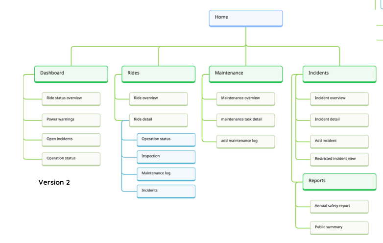
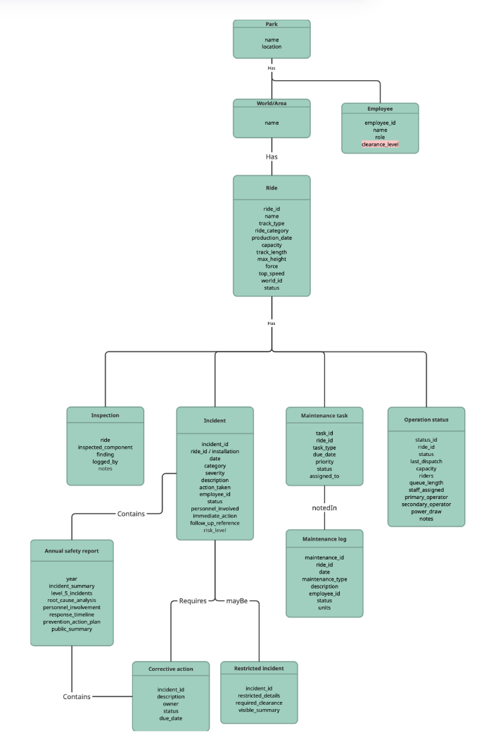
Before designing the screens, I worked on the structure of the system. I looked at the main content objects, such as rides, incidents, maintenance tasks, safety checks and reports.
I also used domain modelling to understand how these parts were connected. This helped me decide what information should appear together, what needed a detail page and where users needed filters or overview screens.

Business rules & logic
Because this was a complex interface assignment, I also worked with business rules. These rules helped define how the system should behave in certain situations.
For example, the system needed to support rules around wind speed, emergency maintenance, preventive maintenance, incident logging, staffing, queue management and restricted incident access. This made the design more realistic, because the interface had to respond to actual operational logic.
Interface patterns
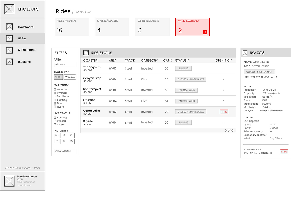
I used different interface patterns to make the system easier to use. Dashboards were used to give users a quick overview of important information. Data tables and filters helped users search, sort and compare larger amounts of information.
Forms were used for logging maintenance work and incidents. Detail pages were used when users needed more context about a specific ride, task or incident. These patterns helped make the interface more structured and easier to navigate.



Detailed lo fi design
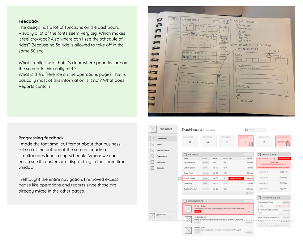
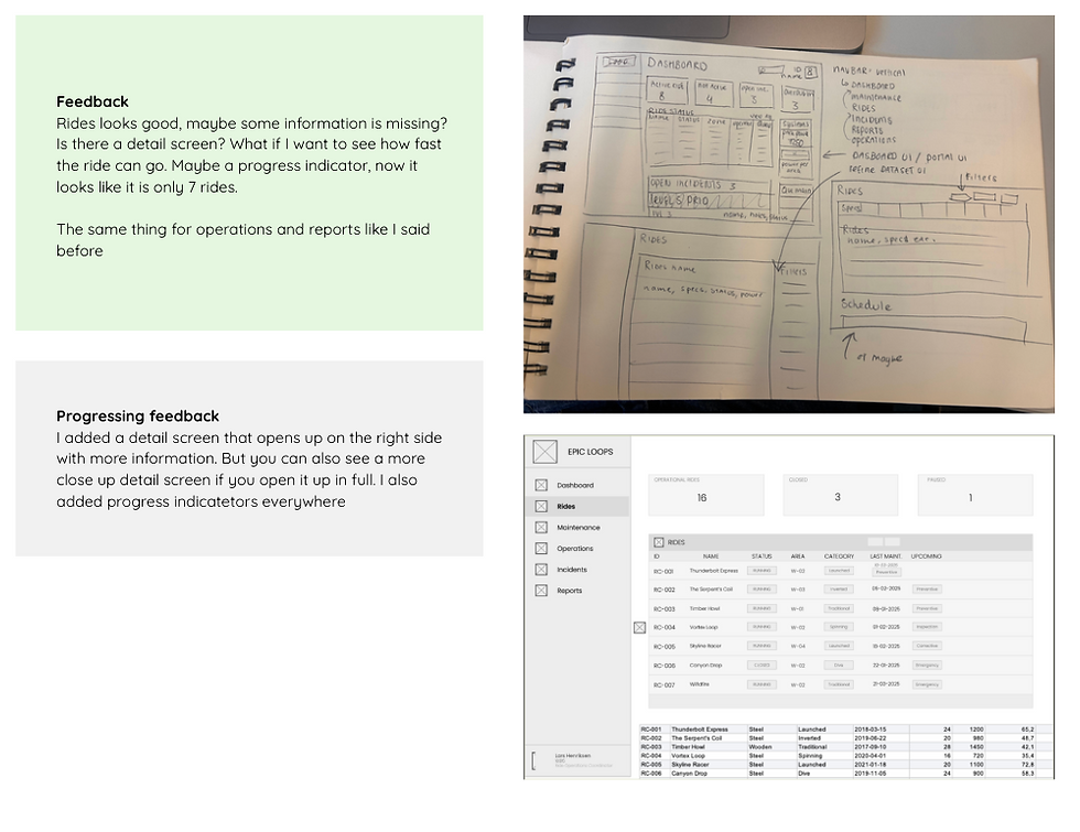
I created detailed lo fi screens in Figma for the main parts of the system, including the dashboard, ride overview, ride detail page, maintenance overview, maintenance log form, incident overview, incident detail page, incident form, restricted incident view, corrective actions and annual safety report. Even though the design was lo fi, I focused on making it detailed enough to show the real structure of the product. The screens included navigation, tables, filters, buttons, forms, states and important content areas.


Solution
The final design is a detailed lo fi management interface for a theme park setting. It brings ride operations, maintenance, safety inspections and incident tracking together in one structured system.
Outcomes
The final design shows how a complex internal system can be made more understandable through clear structure, strong navigation and the right interface patterns.
Instead of focusing on visual styling, this project focused on how information is organised and how users move through a complex system. This helped me understand that UX/UI design is not only about making screens look good, but also about making complicated work processes easier to follow.
What I learned
I learned that persuasive design is not only about making users come back, but also about supporting them in a way that feels helpful, realistic and human.
I love turning complex workflows into clear, human-friendly tools.