Sweepy
Design of a cleaning app redesign
Making household chores feel less overwhelming and easier to start.

Role
UX / UI Designer
Type
App redesign / function implementation
Tools
Miro, Figma, Photoshop, Illustrator
Key results
-
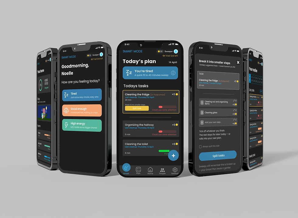
Developed SMART mode to help users start cleaning without feeling overwhelmed
-
Added task splitting to make large cleaning tasks feel smaller and more achievable
-
Improved navigation, contrast and screen structure based on feedback
Context & design challenge
Sweepy is an existing cleaning and chore planning app. The app helps users organise household tasks by room, schedule cleaning moments, track progress and stay motivated through features like coins, streaks and rewards.
For this school assignment, I redesigned parts of the app while staying close to the original concept. The goal was not to create a completely new app, but to improve the experience for a user who needs more calm, flexibility and support.
Design Challenge
"How might we redesign Sweepy so that users who quickly feel overwhelmed by household chores can start, plan and complete tasks in a calmer and more realistic way?"
Process

Research & analysis
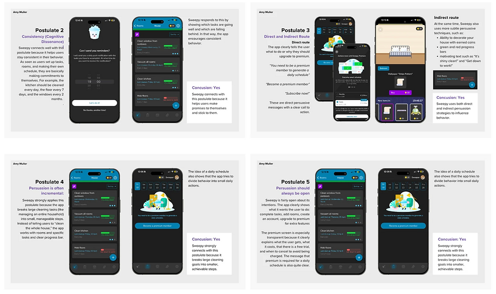
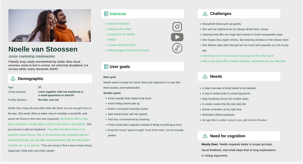
I started by analysing the current Sweepy app and looking at how the app uses tasks, rooms, progress, reminders and rewards. I also created a proto persona for my design challenge.
Behaviour design theory
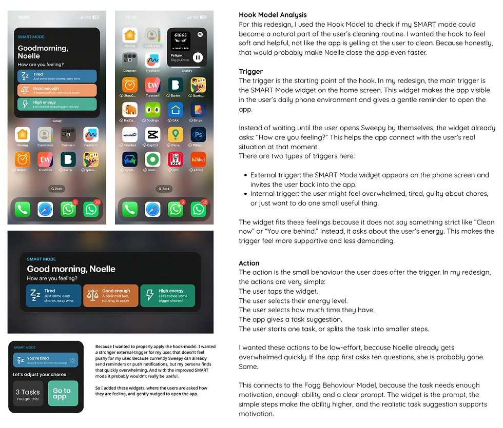
To make stronger design decisions, I used several behavioural models and design theories. The PSD model and 7 postulates helped me think about motivation and persuasive design. The Fogg Behaviour Model helped me understand how motivation, ability and prompts influence whether someone starts a task. The Hook Model helped me look at how triggers, actions, rewards and investment can create repeated use.

Concept direction
Based on the research and theory, I focused on reducing overwhelm. Instead of pushing users to complete everything at once, the redesign supports smaller steps, clearer priorities and more flexible planning. This led to features like SMART mode and task splitting.
Visual design & Prototyping
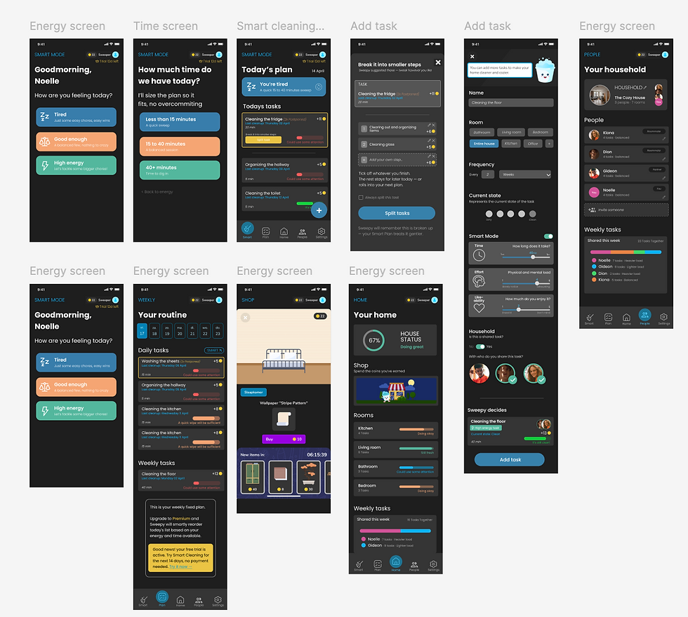
I redesigned the screens in Figma with a focus on calm visual hierarchy, clearer navigation, stronger contrast and a more structured layout. I wanted the app to still feel friendly and motivating, but less busy and easier to understand.
Solution
The redesign makes Sweepy feel calmer, more focused and more supportive. Users can still organise rooms, tasks and cleaning routines, but the experience is less overwhelming.
Outcomes
The final redesign shows how behavioural design theory can be translated into practical UX/UI decisions. By using models like Fogg and Hook, I learned how small interface choices can influence motivation, ability and repeated use.
The redesign improved the structure of the app and made the experience more focused on the user’s emotional state, not only on task completion.
What I learned
I learned that persuasive design is not only about making users come back, but also about supporting them in a way that feels helpful, realistic and human.
I love turning complex workflows into clear, human-friendly tools.